
New Category Creation
I worked with a lead designer (Kris Aubuchon) to help lead the design process on our recent changes to the category creation interface. Our previous category setup interface overloaded new users with options and information that is not relevant to them. We wanted to explore ways to remove any barriers a user may face when setting up this important structure of their forum.
Where we came from
Discourse can be seen as very complex to users without a technical background, and we want to make it easier for that target user to get up and running quickly on a new forum. One of the first things new site owners do is organize the forum for the discussions they'd like to see taking place. Setting up categories is one of the steps to doing so.
Through a couple brainstorming & exploratory sessions we determined the simplest next step would be to work with what we had available to us. Instead of reworking the creation flow, we determined to make the current version a lot more simple by moving elements around, or hiding them from most users.
- We were presenting the user with too many navigation elements in this section.
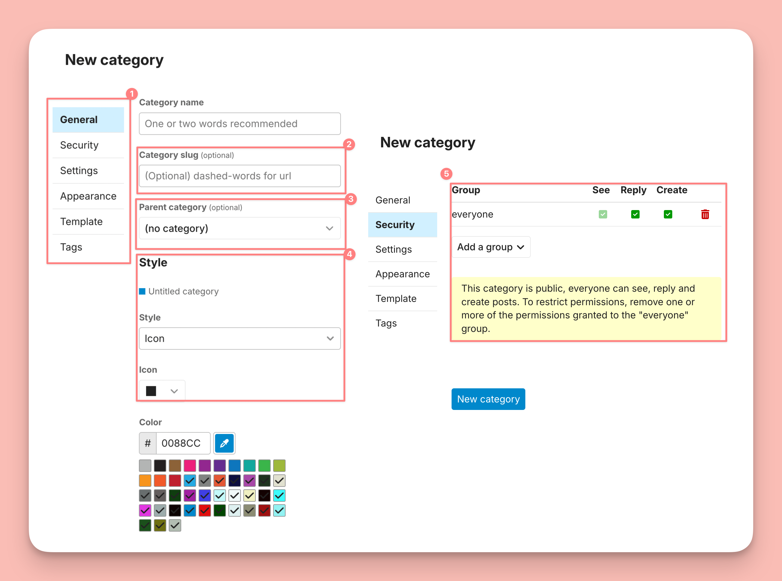
- We determined that "category-slug" is not something a user should be concerned with in category creation
- Choosing a parent category might be important, but we determined it should not be the second or third option a user sees when going through this process.
- Style & Color choice are the more fun elements of category creation, but the experience was unpleasant, and were last on the previous creation flow.
- The security / visibility options were confusing, even to us as creators of the software. This needed to change.
Where we landed
With these highlights in mind, the lead designer for the category creation took our team insights and got to work. After only a handful of feedback sessions, the designer was able to come up with a much simpler & more rewarding creation flow.
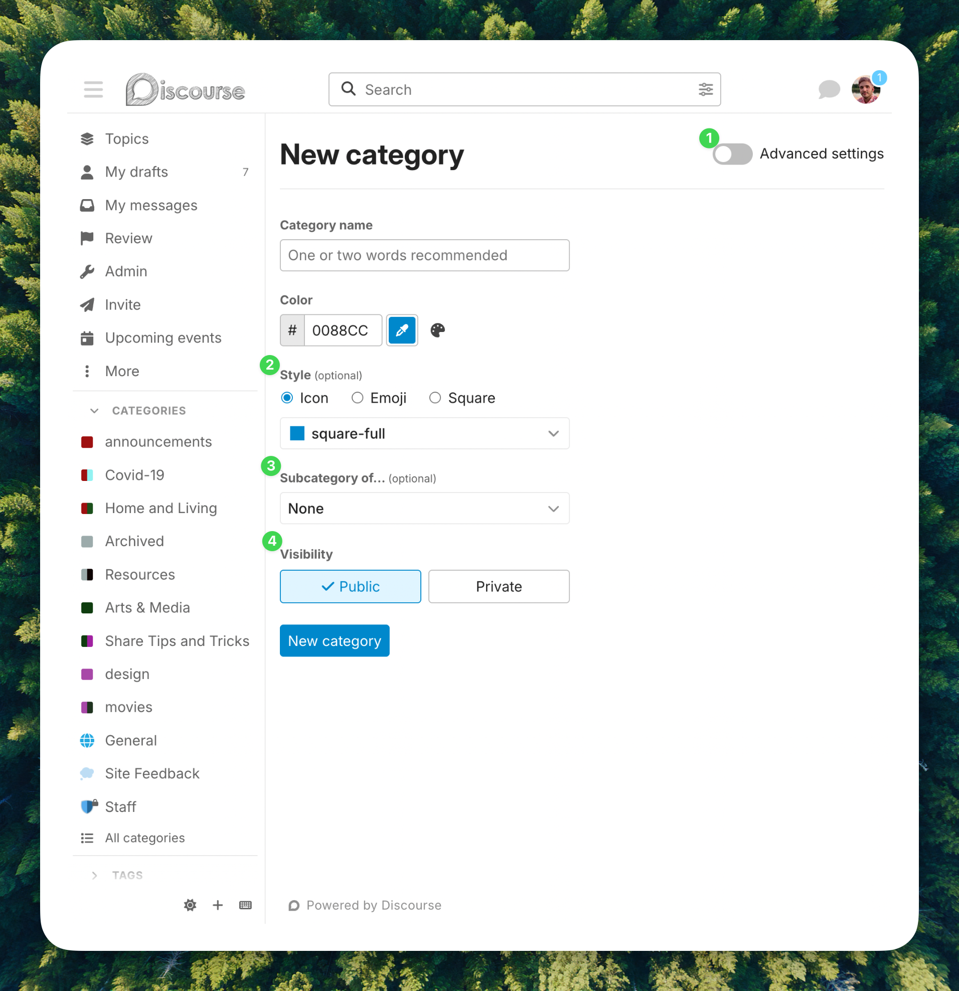
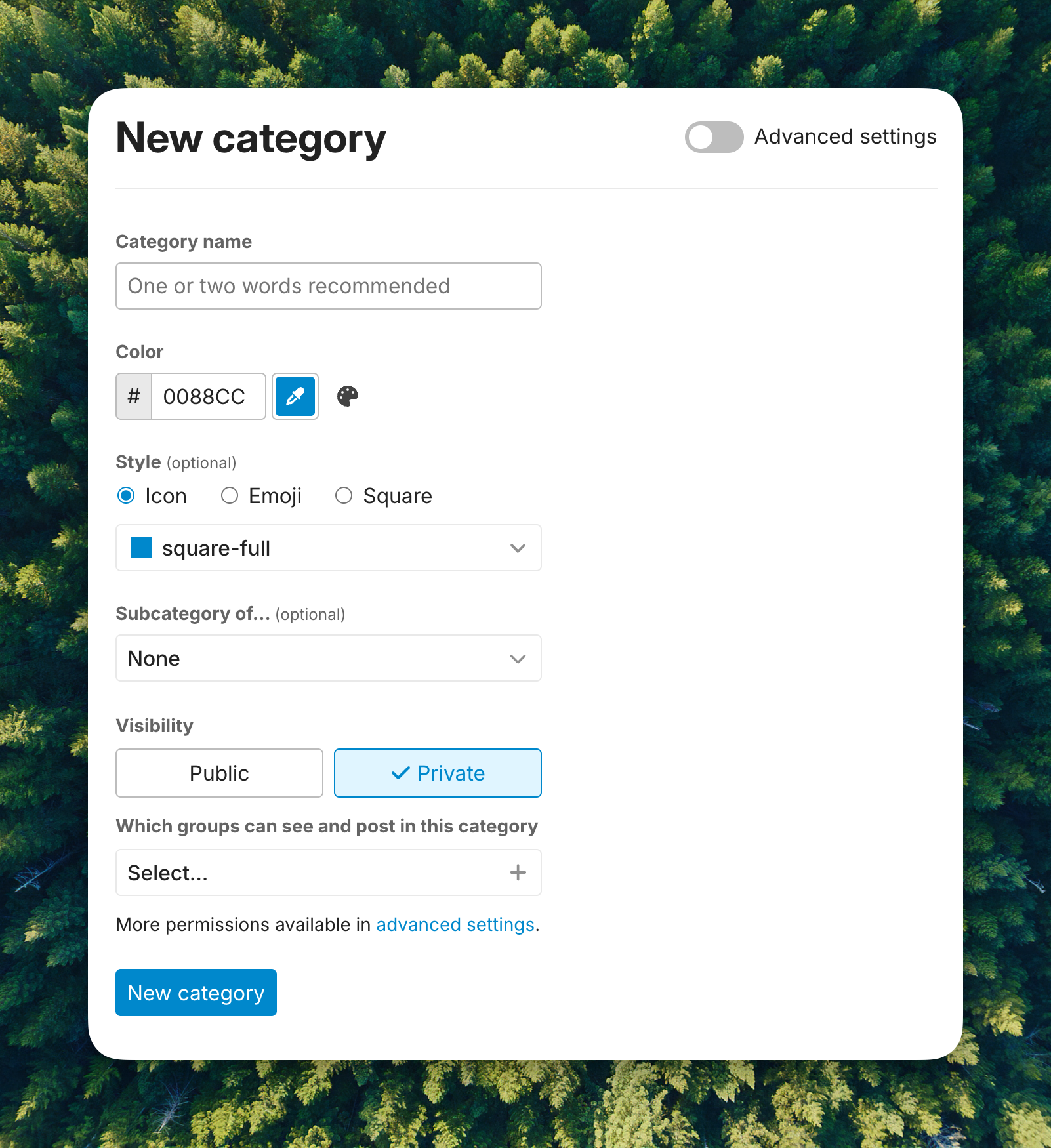
- Because most people will never need to change any of these settings, we put the more advanced settings that cluttered up the navigation behind an "advanced" toggle.
- We combined the different style options into one experience, allowing for a much easier setup of the visuals for a category.
- While a subtle change, we determined the wording of "Subcategory of..." was quicker to understand than having to choose which parent your new category belonged to.
- We brought the security options to the front, and simplified them with two options for either public or private.