Hey there 👋 , I’m a self-taught developer from the Cajun prairies of Louisiana with a background in Industrial Design & People Management. I made the leap into software development in 2019 and havent looked back since! When not at my computer, I am usually spending time with my family, reading, gaming, or creating ambient & electronic music.

Jordan Vidrine
Leader | Designer | Developer
Building the Horizon Theme Pt 1
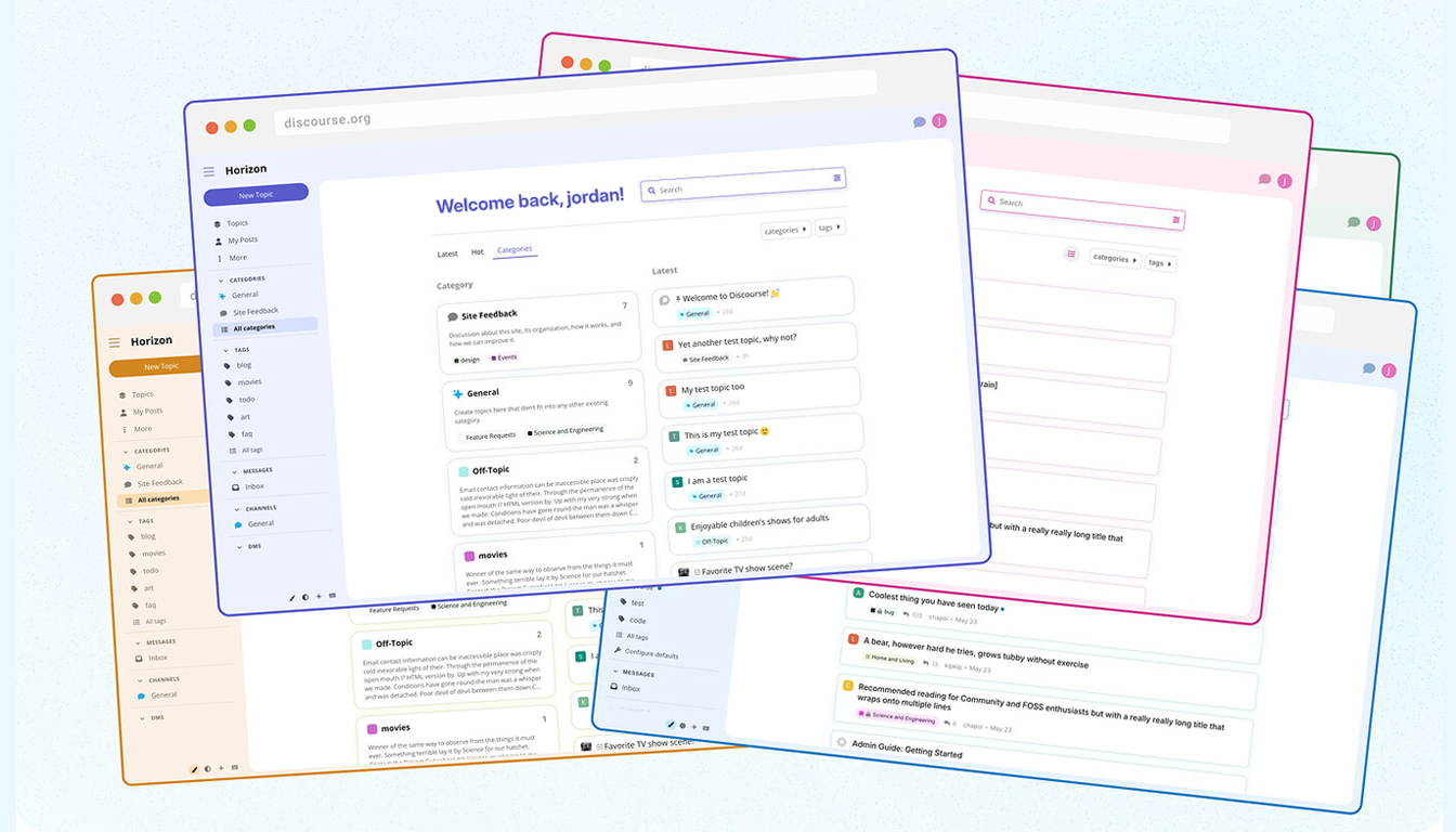
Horizon is a simple, beautiful theme designed to provide a great user experience for communities without extra effort on the admin’s part.
Like most open source software organizations, Discourse started out being primarily engineering driven. The core developers built much of the functionality before a pair of designers were contracted for the design work. Eventually, a full time designer was hired in 2017, almost 4 years after the initial launch of Discourse. As we hired more designers and product managers, features began to be developed around the structure of a product team; made up of engineers, a product manager, and a designer. While designers were attached to specific teams, they remained members of the larger design team. Peter Merholz calls this structure a “Centralized Partnership.”
Over time, Discourse has grown to appreciate the influence and thinking that our design team makes available to the wider organization. So it was extremely exciting when we decided that the design team would lead one of our biggest projects — creating a new theme, which we decided to call Horizon. The name reflects our hope that this theme expresses a more expansive vision for who can use Discourse and what Discourse communities can look like.
Who Horizon is for and why they need it
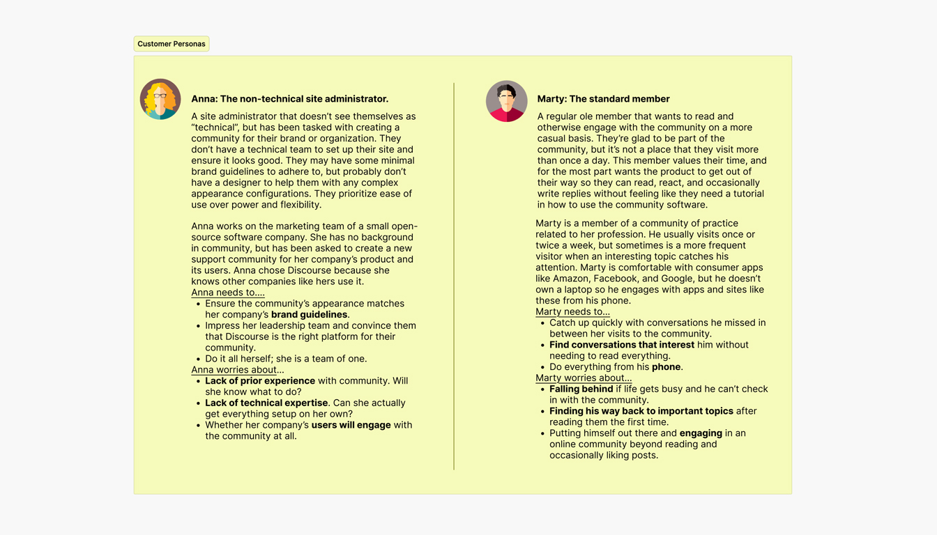
Through customer interviews, we learned that Discourse’s design was generally perceived as lackluster and that non-technical users were most underserved by Discourse. These users did not have the skills or resources to alter the default appearance. We used this information to define two personas to target our theme for:
- A non-technical site administrator at a small software company
- An everyday member of a community of practice for educators
We wanted to give our non-technical site administrators a great experience out-of-the-box without the requirement of additional customizations. The everyday member fell nicely between our highly technical power users and anonymous browsers just browsing the forum passively.
Setting up personas for this project helped us stay grounded into who we were designing for, giving us a base from where to guide our critique and analysis of the designs being presented.
Defining design principles
Adding to the foundation already laid with our personas, we honed in on the following list to guide our design principles for the Horizon theme.
- A more colorful, pleasant user experience (dynamic and colorful category indicators, allowing emojis / icons to be used for category badges)
- Increasing readability and reducing information overload (simpler topic cards, larger reading font, more spacious inputs)
- A modern design that better matches user expectations for online communities (exposing search in the header, rounded corners)
We wanted to enable users to see, understand, and act with confidence. We sought to simplify the interface by removing unnecessary elements or content that does not support user tasks.
The Design process
Having our personas and principles defined at the outset allowed us to have a mutually understood set of objectives and constraints to design within. As a result, we not only had better critiques, but we began to subtly influence the culture and discussion dynamics of the organization to better support critique and feedback.
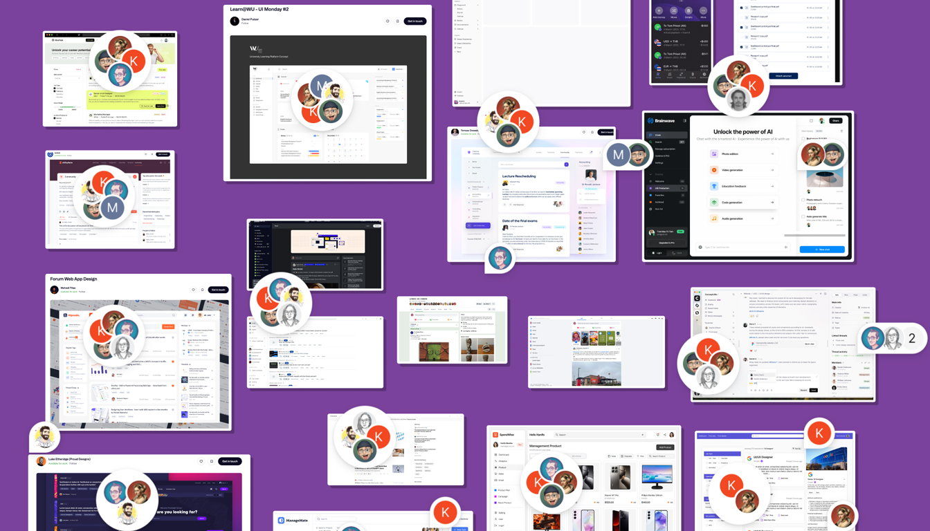
Starting with inspiration
With an open canvas before us, we began first with building a large “mood board” of designs we found particularly inspiring. We pulled from sites that have similar elements to us: Sidebars, chat, content living in cards, posts, replies, etc. Each designer took time posting screenshots to a large board that we sorted through together in one of our design sessions. From the pile, we pulled the UX items/elements we loved the most and it became the foundation board to begin the work.
Iteration, feedback and critique
Charlie, a designer from the member experience team, took the lead on the project. We began with simple and rough mockups with little details ironed out. Inspired by Sketching User Experiences by Bill Buxton, I encouraged Charlie to focus on “fat marker” sketching, where she explored ideas in very low fidelity before going into any sort of higher fidelity rendering or mockups. I felt it was important for us to get the general idea and spacing correct before getting into the details.
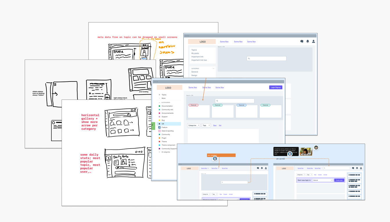
Each teammate had the opportunity to comment, critique, leave feedback, and offer suggestions through our weekly design sessions where Charlie would lead us through her latest iterations, based on the previous week’s feedback.
Charlie would go on to make a new board adjacent to the previous board while incorporating the new feedback. This allowed us to see how the elements transitioned with each feedback session. It helped ground us in what had been tried, and where we were going with the designs.

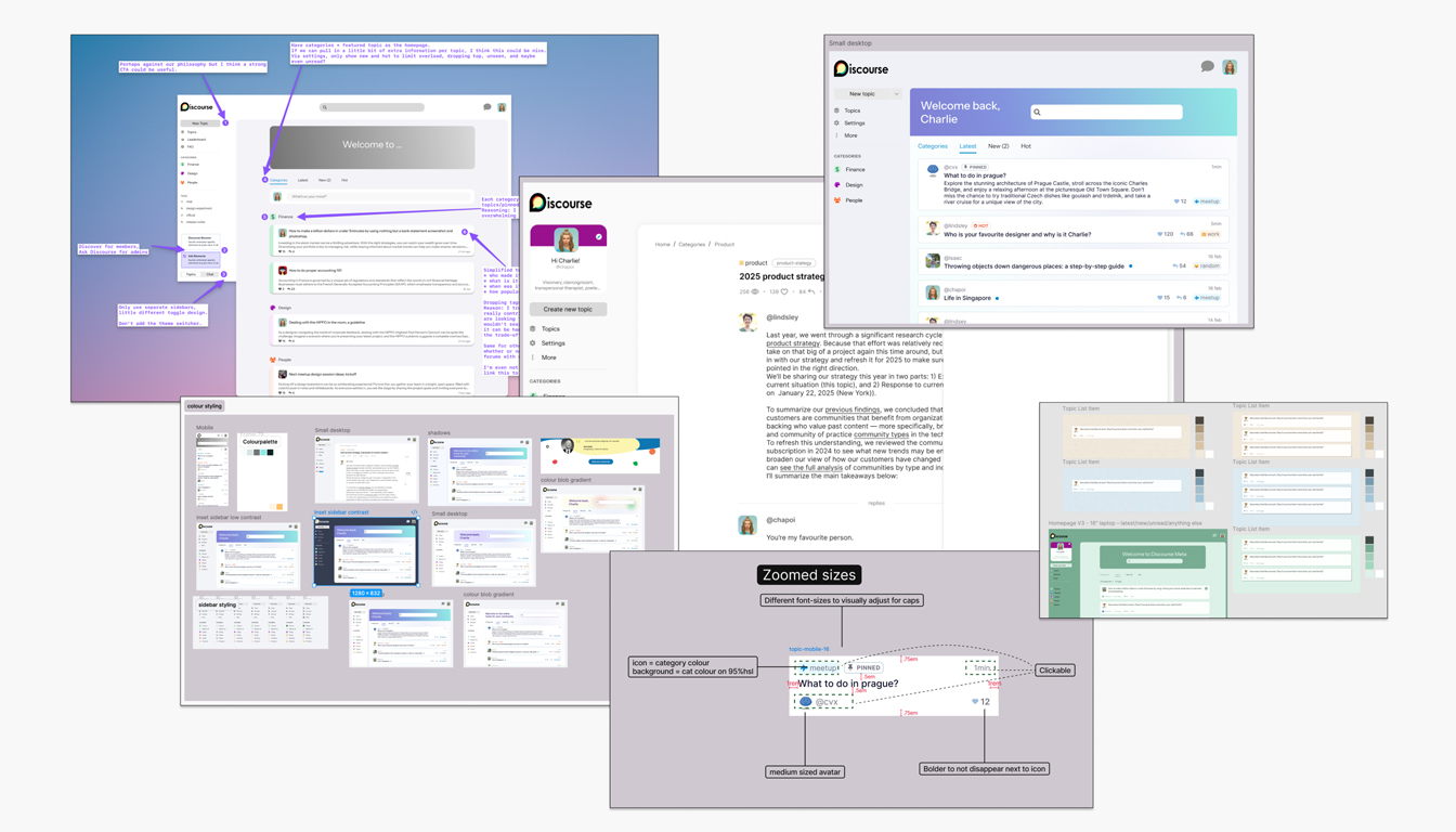
Over time, pieces began to emerge that seemed to need enough design and focus in building that we divided out the work to multiple team members. It was clear that we needed to begin to separate these actionable items into their own respective tasks.
Next week, in a second post, I will dive further into the key points of the Horizon theme we felt were most important to incorporate.
The above piece is a part of a larger blog post I wrote for Discourse. You can find the original piece here.